Aura Music App
Aura is a music platform designed to reconnect older generations with the songs that shaped their lives.

Company
Aura Music App
Year
About Project
Aura is a digital music platform designed to reconnect older generations with the songs that shaped their lives. In a streaming landscape dominated by algorithm-driven discovery and fast consumption, Aura takes a different position, it priorities memory, emotion, and timeless melodies.
The core challenge was to build a brand identity that speaks to nostalgia without looking outdated, and feels digital without becoming cold or generic.
Our role was to create a complete brand system that balances emotional depth with modern clarity.
BRAND STRATEGY
Aura is not competing with mainstream streaming platforms on volume. It competes on emotional value.
Strategic Direction:
Position music as memory, not background noise
Focus on emotional recall and familiarity
Design for trust and comfort
Avoid loud, trend-heavy aesthetics
Build a calm, refined visual presence
The identity needed to feel respectful of legacy, but not stuck in the past.
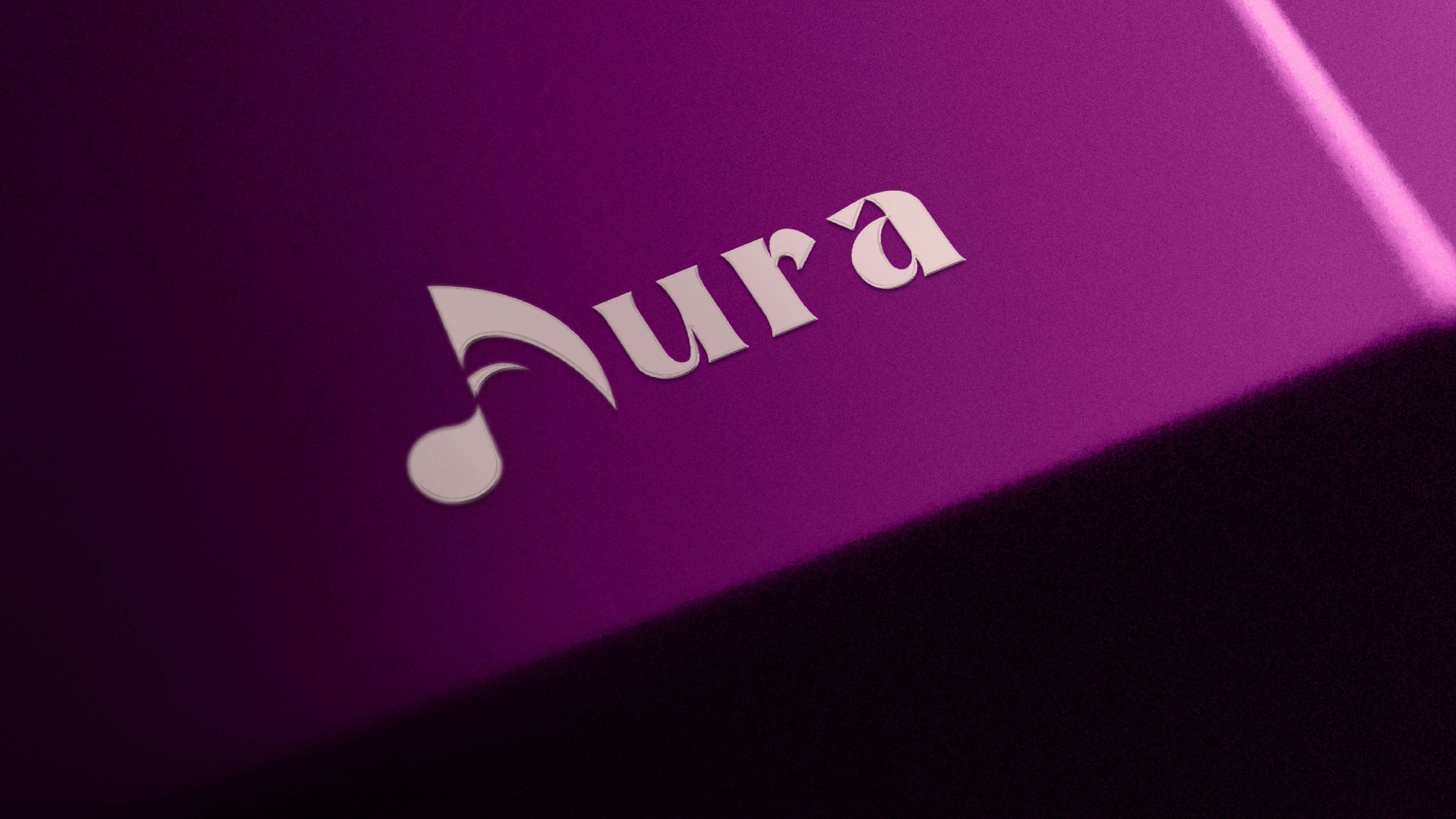
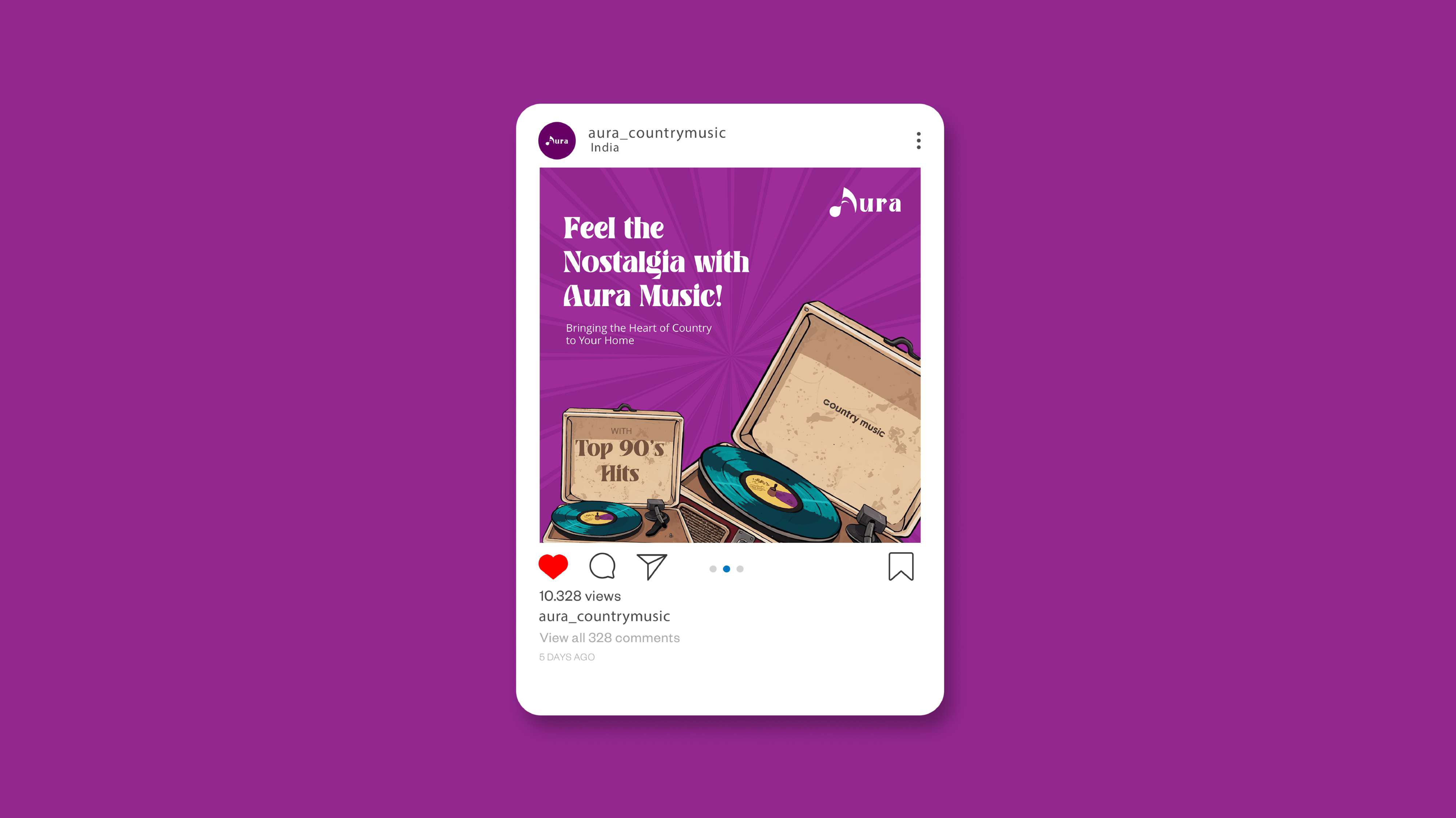
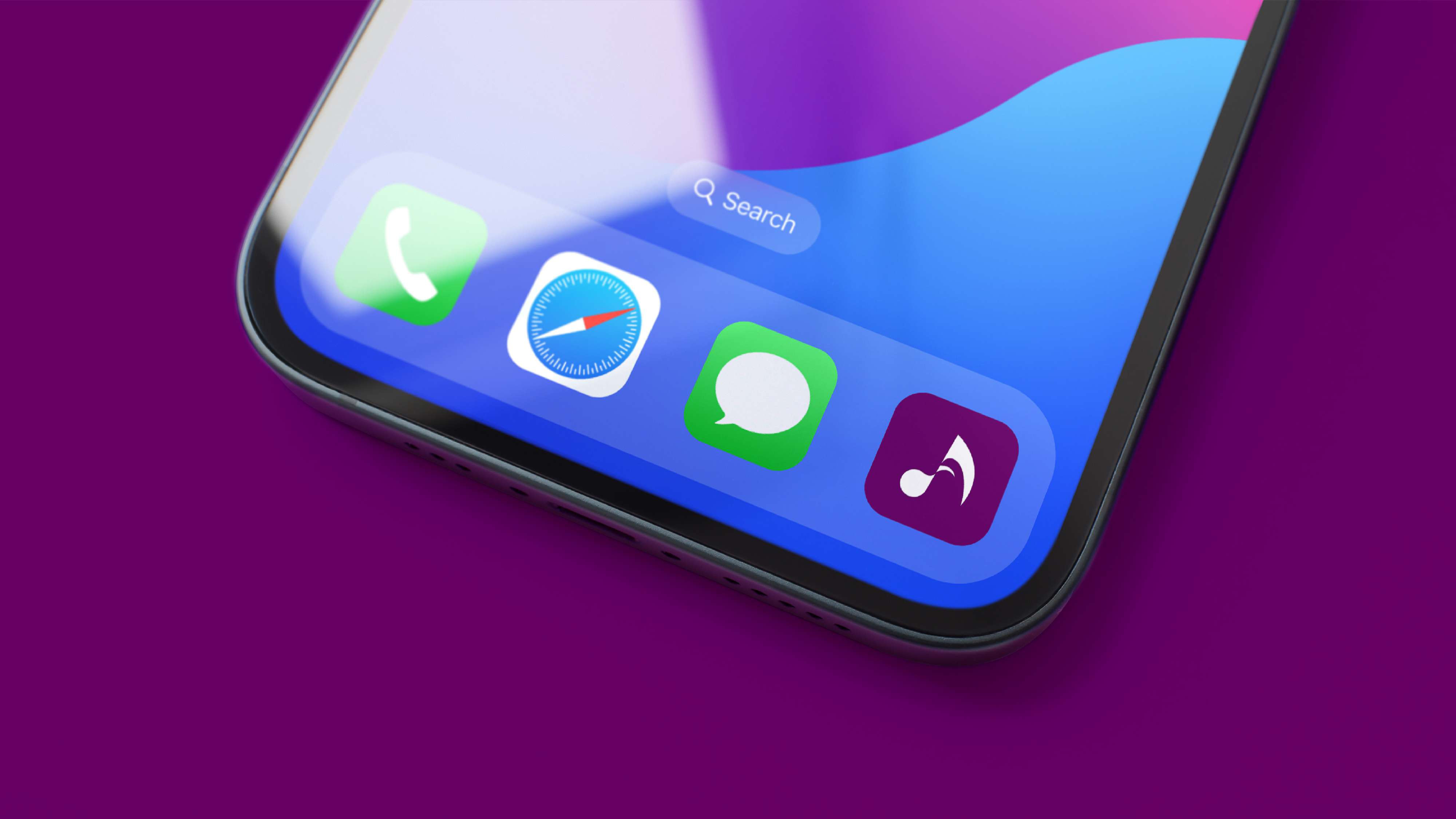
LOGO DESIGN
The logo was developed to reflect softness, warmth, and timelessness.
Approach:
Elegant letterforms with subtle curves
Balanced spacing to create visual calm
Refined proportions for readability across digital platforms
Scalable design for app icon, website, and social use
The logo avoids aggressive shapes or overly stylized typography. Instead, it communicates familiarity and emotional resonance.
 | 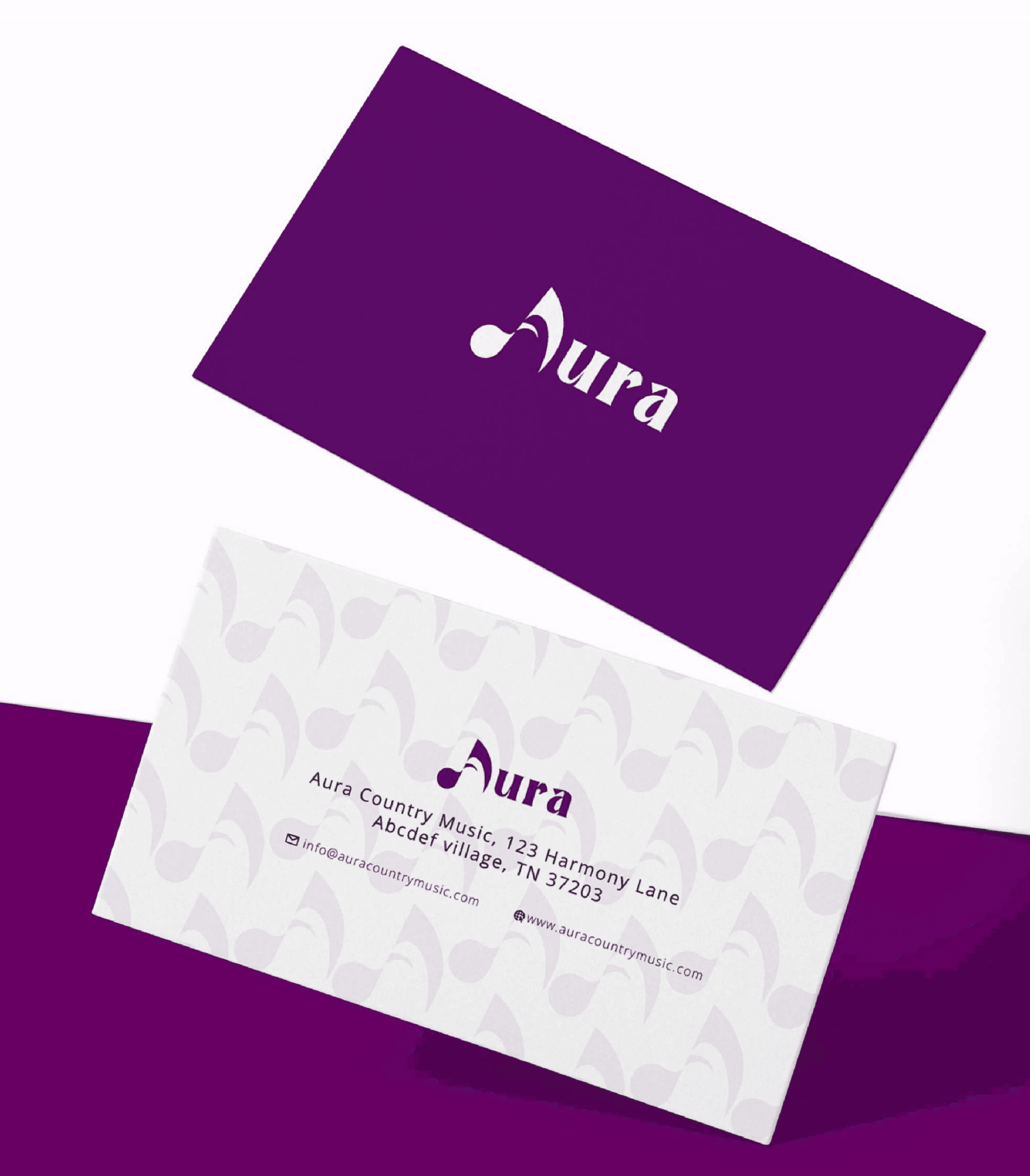 |
TYPOGRAPHY SYSTEM
Typography was central to the identity.
Key Decisions:
Primary typeface with classic proportions
Secondary sans-serif for digital clarity
Strong hierarchy system for readability
Generous spacing to avoid visual noise
The combination ensures:
Comfort for older audiences
Accessibility across screens
Modern digital usability
PROJECT OUTCOME
Aura presents music not as endless content, but as curated emotional memory.
The final brand identity feels:
Familiar but not dated
Elegant but not fragile
Modern but not aggressive
Clear but not sterile
It respects musical legacy while embracing digital accessibility.
About Project
Aura is a digital music platform designed to reconnect older generations with the songs that shaped their lives. In a streaming landscape dominated by algorithm-driven discovery and fast consumption, Aura takes a different position, it priorities memory, emotion, and timeless melodies.
The core challenge was to build a brand identity that speaks to nostalgia without looking outdated, and feels digital without becoming cold or generic.
Our role was to create a complete brand system that balances emotional depth with modern clarity.
BRAND STRATEGY
Aura is not competing with mainstream streaming platforms on volume. It competes on emotional value.
Strategic Direction:
Position music as memory, not background noise
Focus on emotional recall and familiarity
Design for trust and comfort
Avoid loud, trend-heavy aesthetics
Build a calm, refined visual presence
The identity needed to feel respectful of legacy, but not stuck in the past.
LOGO DESIGN
The logo was developed to reflect softness, warmth, and timelessness.
Approach:
Elegant letterforms with subtle curves
Balanced spacing to create visual calm
Refined proportions for readability across digital platforms
Scalable design for app icon, website, and social use
The logo avoids aggressive shapes or overly stylized typography. Instead, it communicates familiarity and emotional resonance.
| |
TYPOGRAPHY SYSTEM
Typography was central to the identity.
Key Decisions:
Primary typeface with classic proportions
Secondary sans-serif for digital clarity
Strong hierarchy system for readability
Generous spacing to avoid visual noise
The combination ensures:
Comfort for older audiences
Accessibility across screens
Modern digital usability
PROJECT OUTCOME
Aura presents music not as endless content, but as curated emotional memory.
The final brand identity feels:
Familiar but not dated
Elegant but not fragile
Modern but not aggressive
Clear but not sterile
It respects musical legacy while embracing digital accessibility.
More Projects
Other Creative Works
01
Ad Films & UGC Content
Contemporary and minimalist design approaches for art exhibitions.

01
Ad Films & UGC Content
Contemporary and minimalist design approaches for art exhibitions.
Ad Films & UGC Content
Contemporary and minimalist design approaches for art exhibitions.
02
OASIS International EMEA-APAC
Contemporary and minimalist design approaches for art exhibitions.
Research & Design

02
OASIS International EMEA-APAC
Contemporary and minimalist design approaches for art exhibitions.
Research & Design
OASIS International EMEA-APAC
Contemporary and minimalist design approaches for art exhibitions.
Frequently Asked Questions
Get quick answers about working with us and our approach to digital solutions.
What kind of projects does Parchhai Studio work on?
We work on brand identity systems, social media design, campaign visuals, website design, film marketing creatives, and content strategy. If a project requires clear thinking, strong visuals, and strategic execution, it fits our zone.
What makes Parchhai Studio different from other design agencies?
We don’t design for decoration. We design for clarity and impact. Every visual is backed by hierarchy, structure, and intent. Our process focuses on solving communication problems, not just making things look good.
What is your process before starting a project?
We start with understanding the objective, not the deliverables. We study the brand positioning, audience behavior, and communication gaps. Only after defining direction do we move into design and execution.
Do you offer long-term creative support?
Yes. We work both on project-based deliverables and ongoing creative retainers. For brands that need consistent content, campaigns, or design direction, we provide structured monthly support.